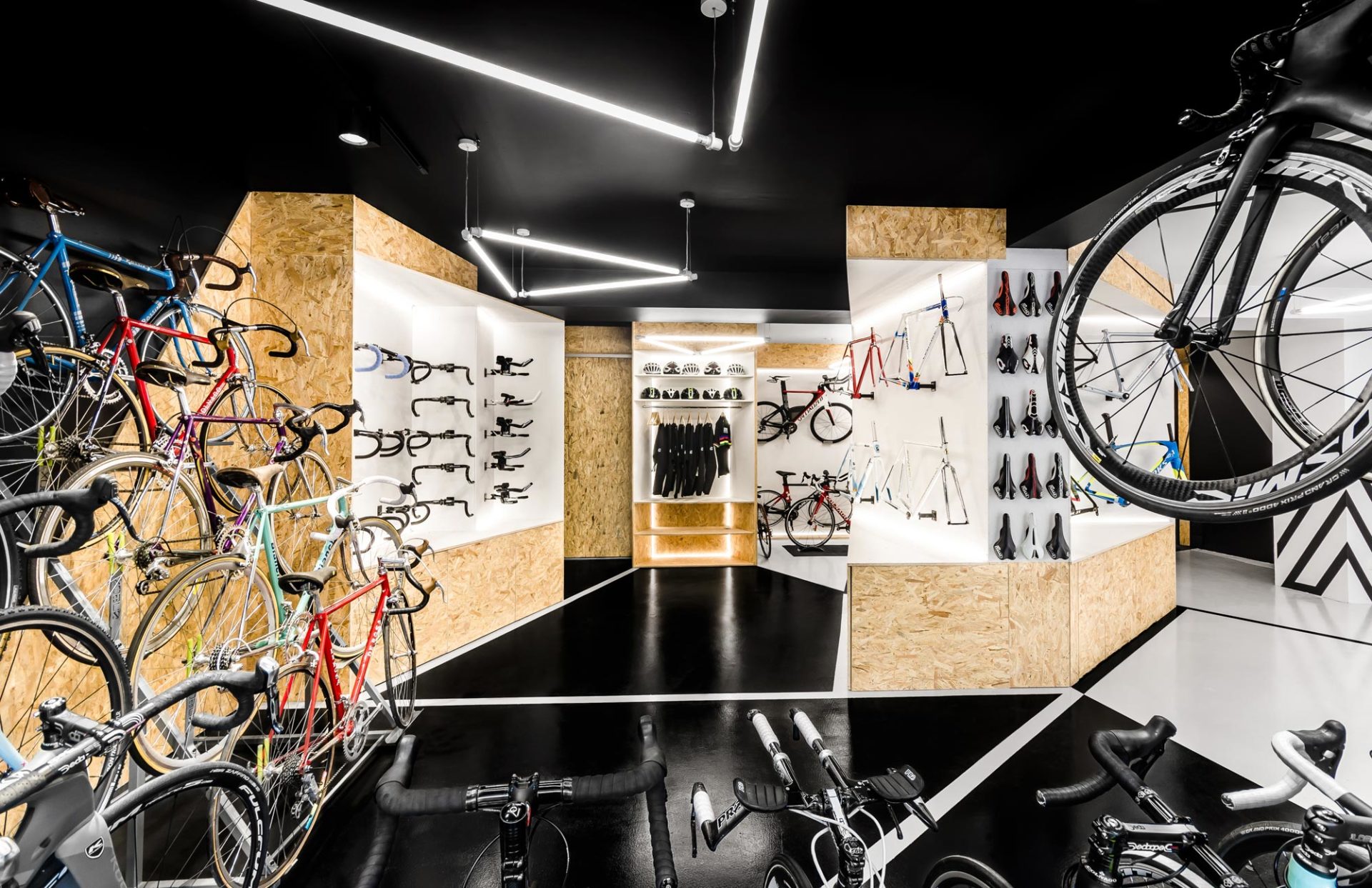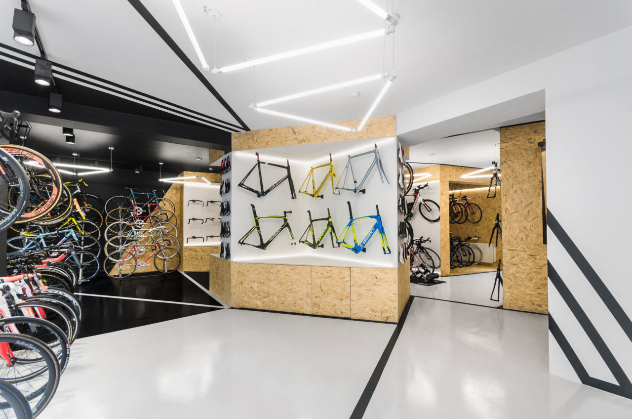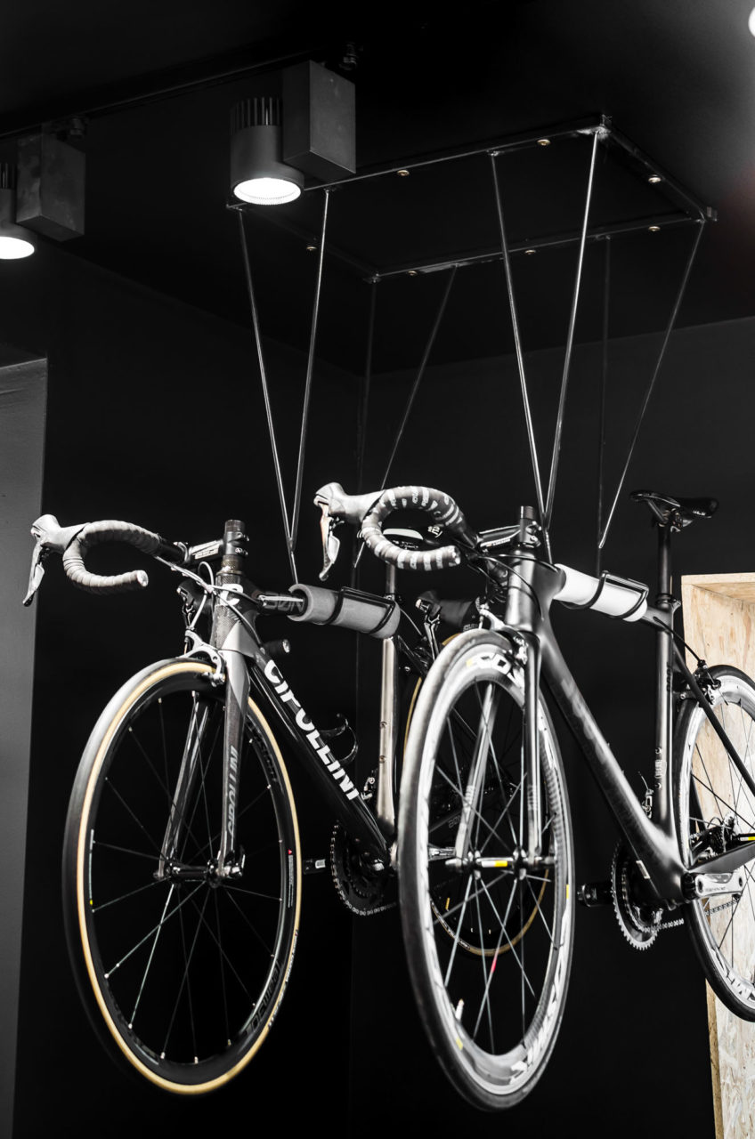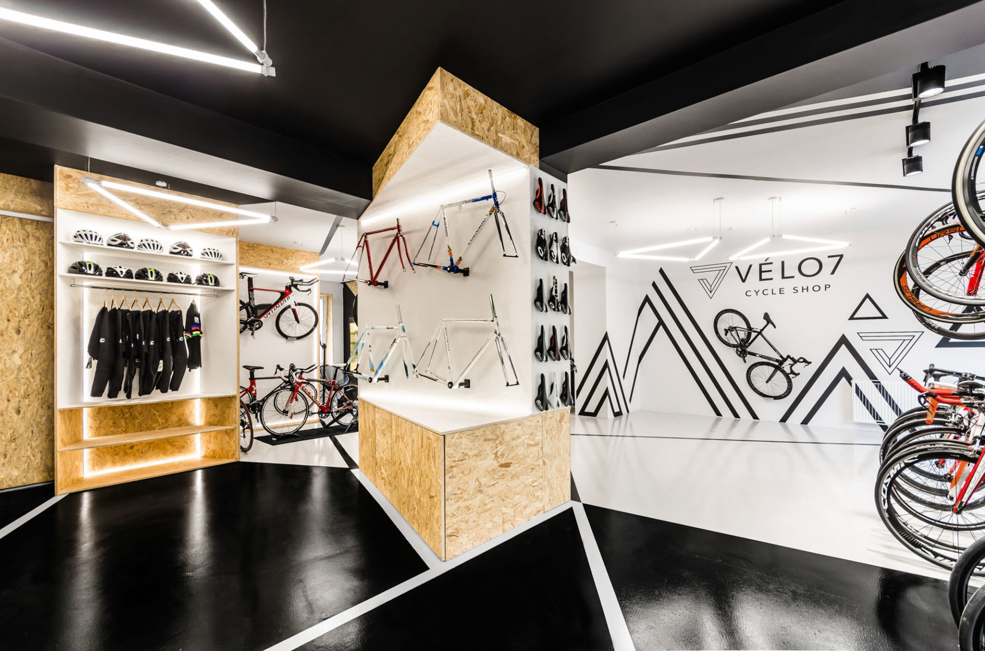
The cyclists needed a multifunctional space which could easily accommodate the functions of a bike shop, service and repair and a place for bike testing. Knowing that in VÈLO7 it is all about two-wheelers, our designers tapped into bicycle inspirations.
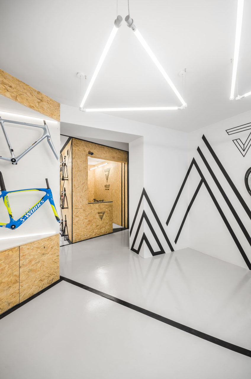
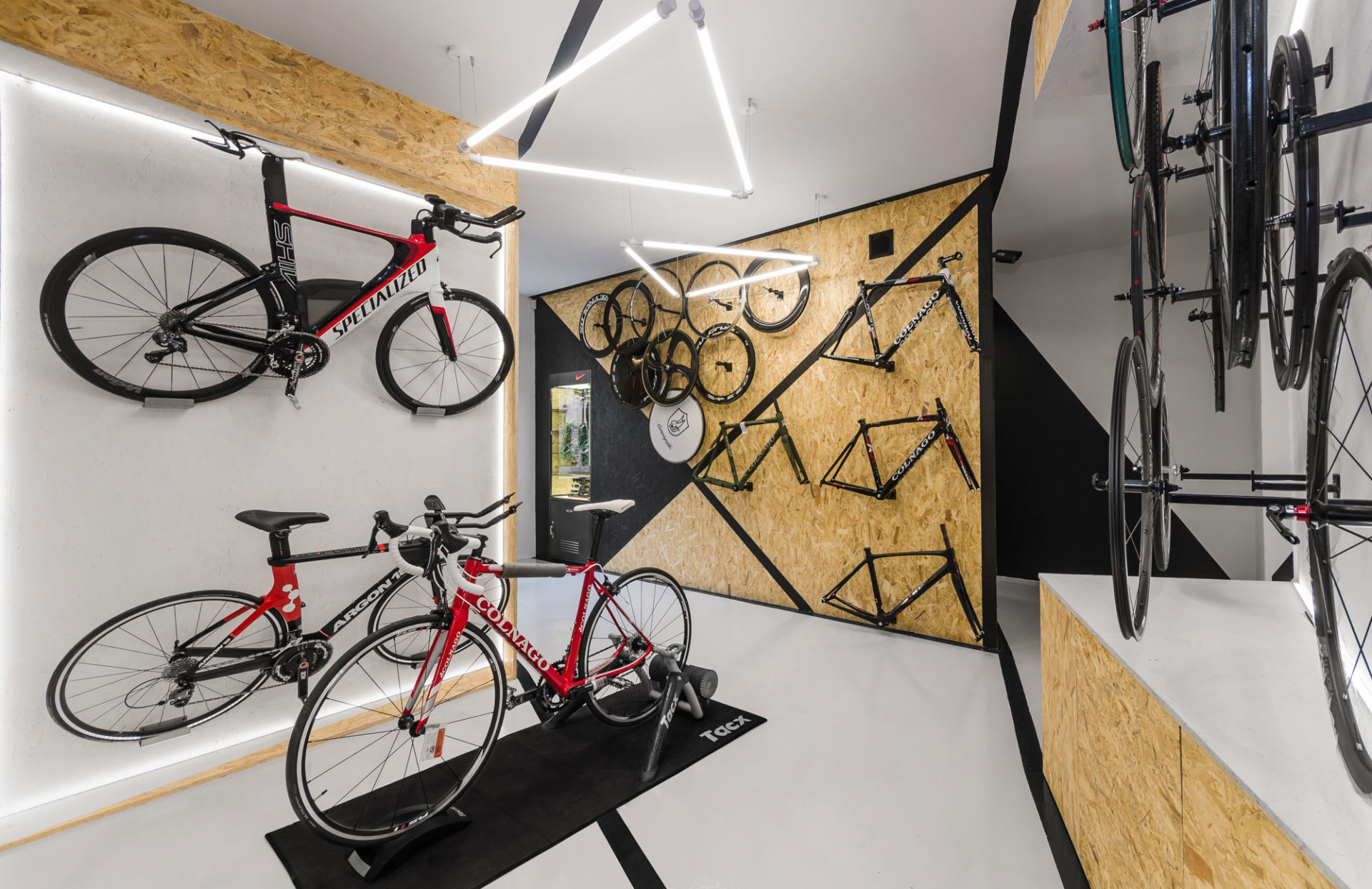
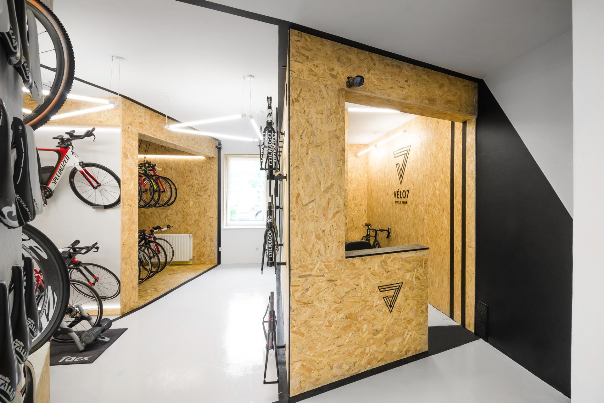
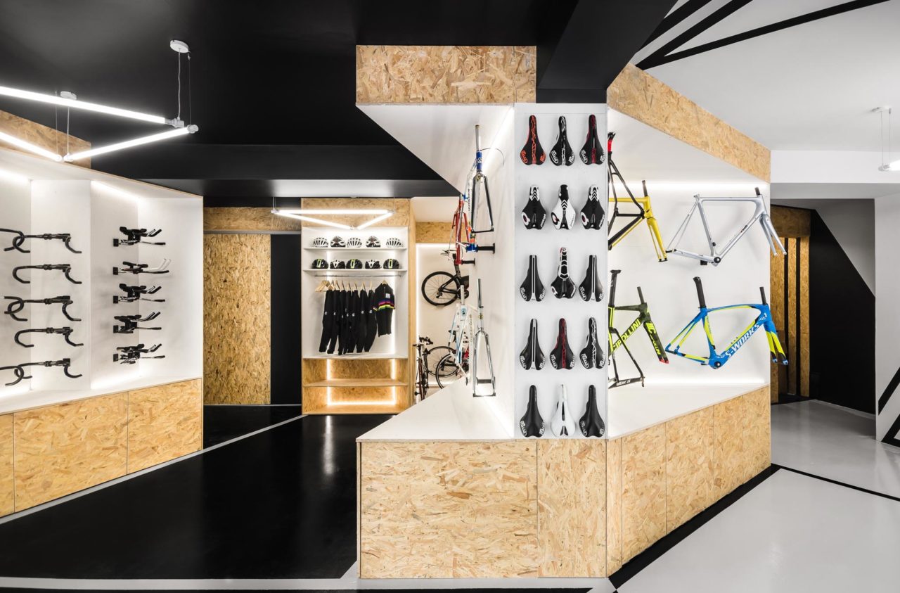
The triangular forms and slant surfaces used throughout the interior refer to the shape of the bicycle frame. Its characteristic geometry was also translated into specially designed bike racks, which resulted in additional space for bike presentation.
Space reflecting bicycle geometry
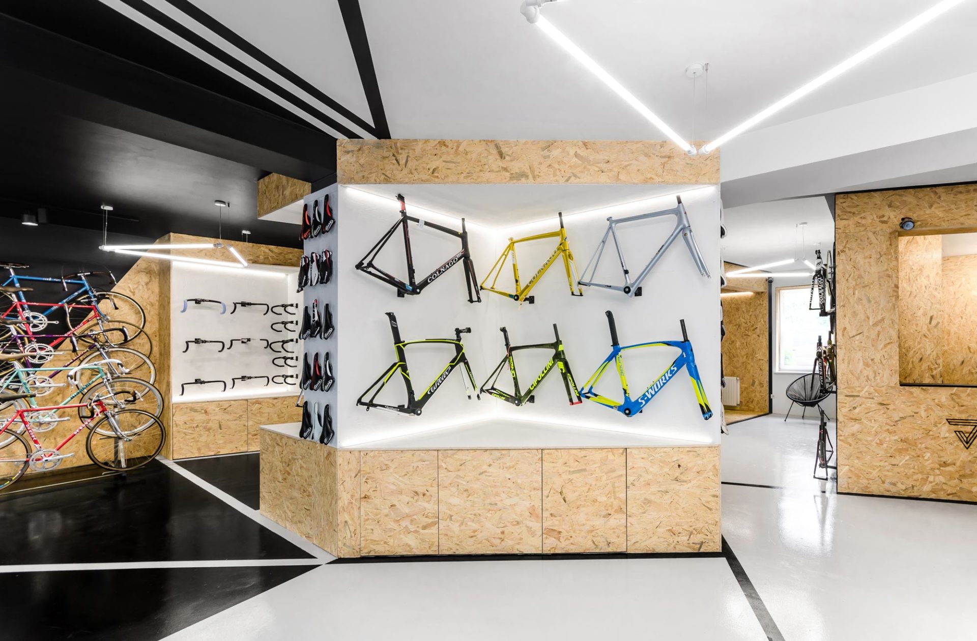
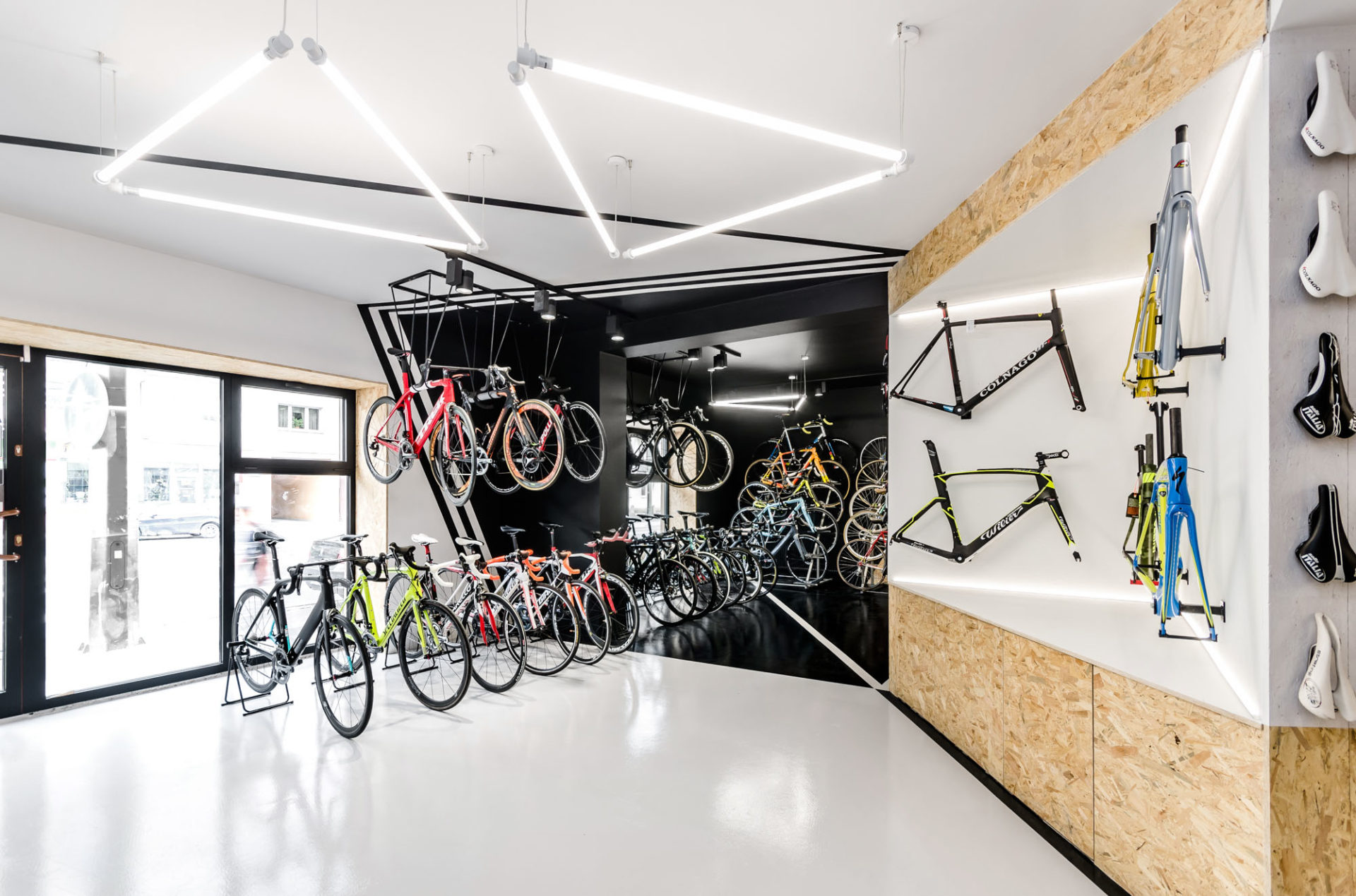
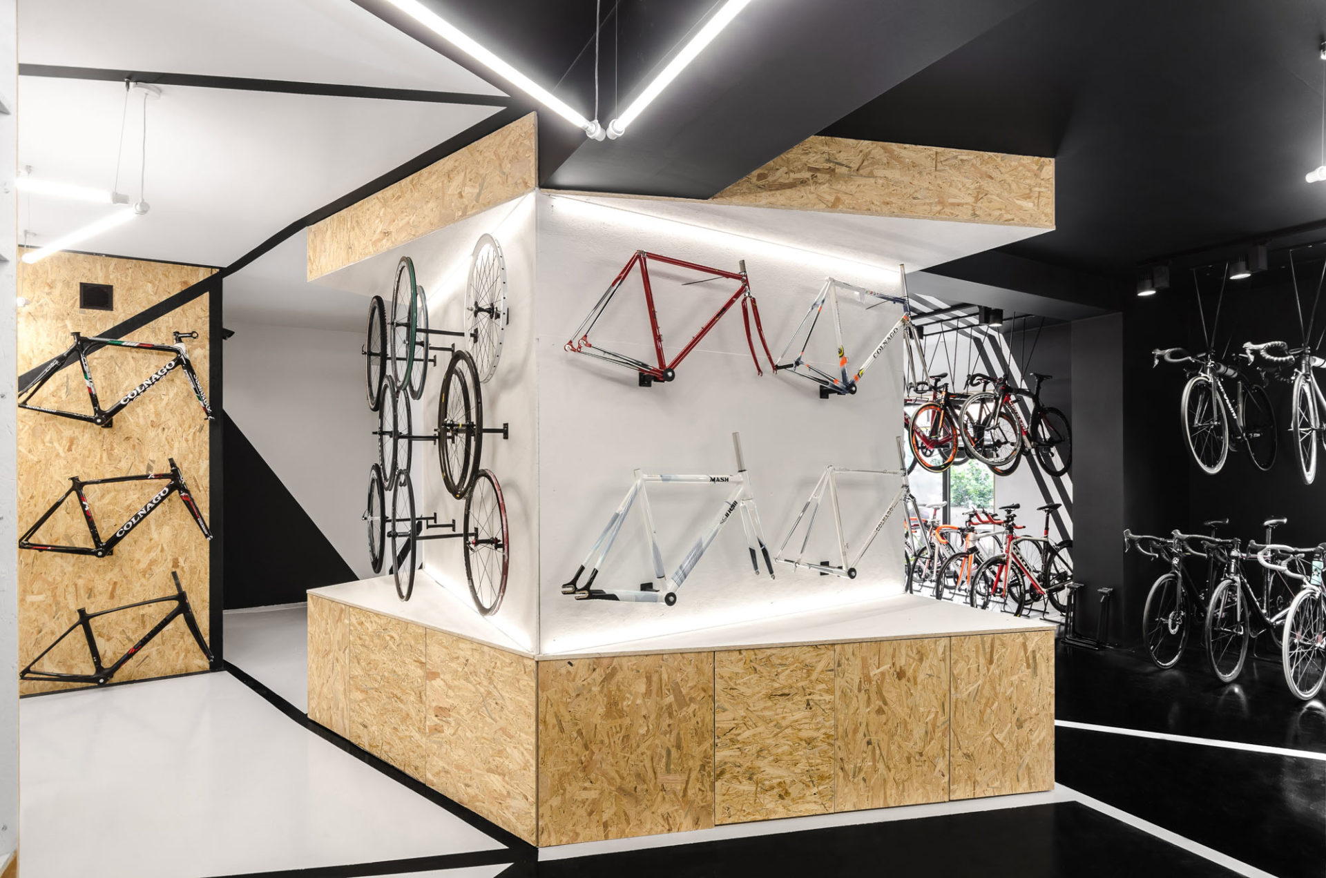
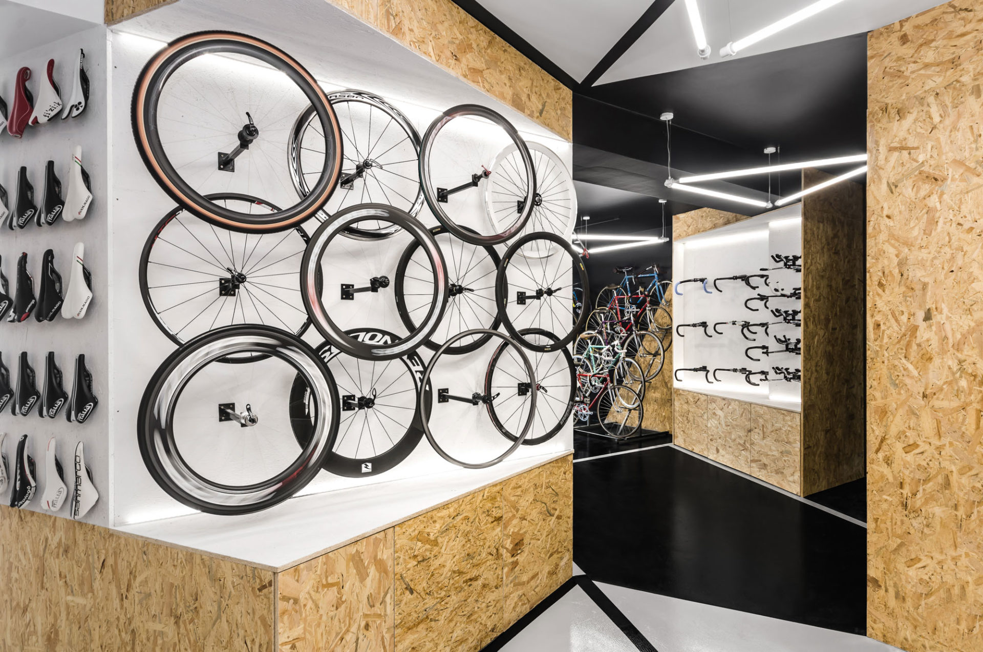
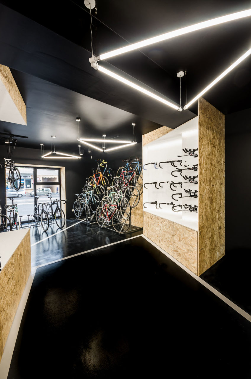
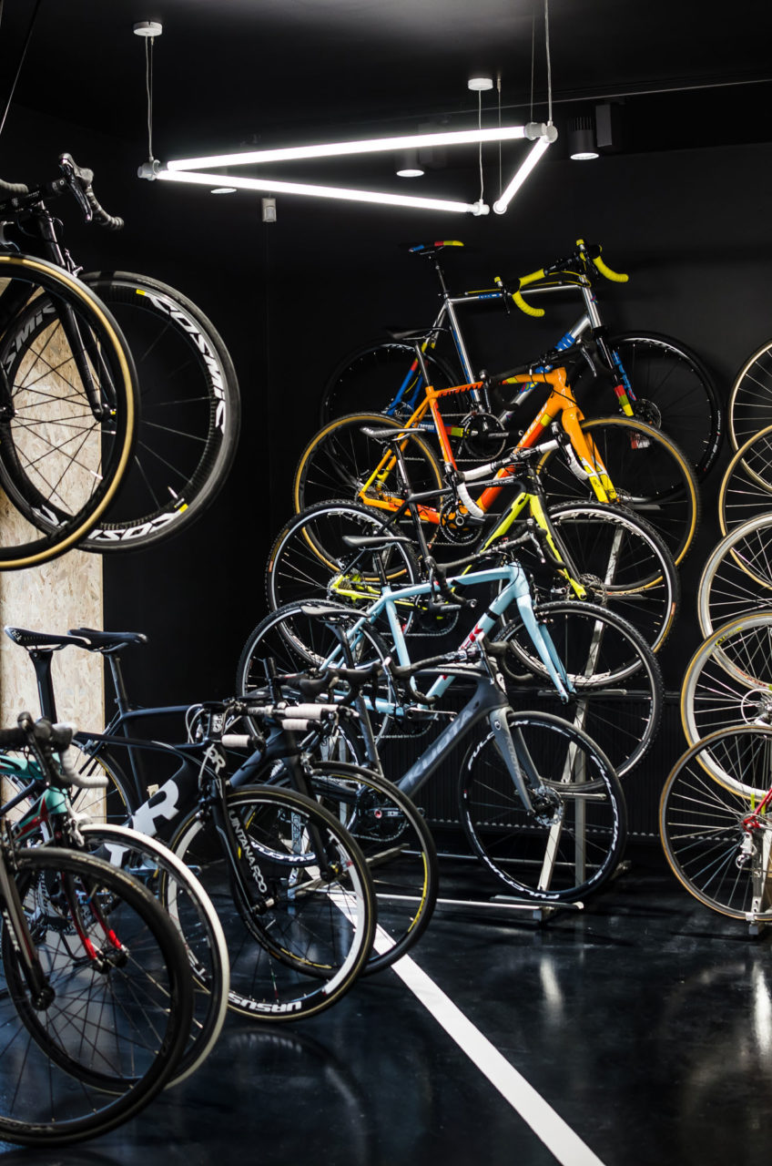
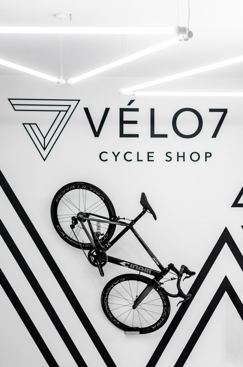
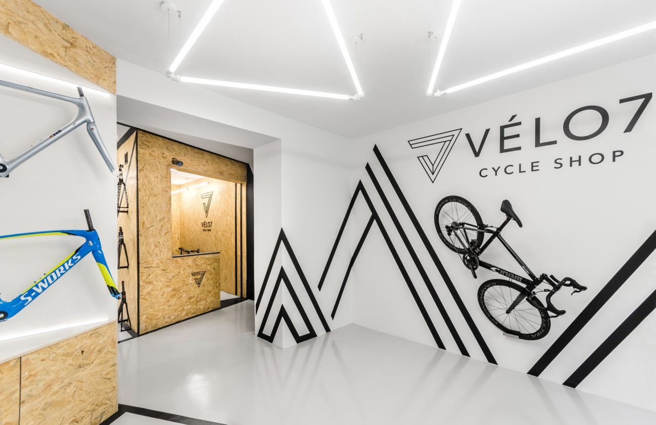
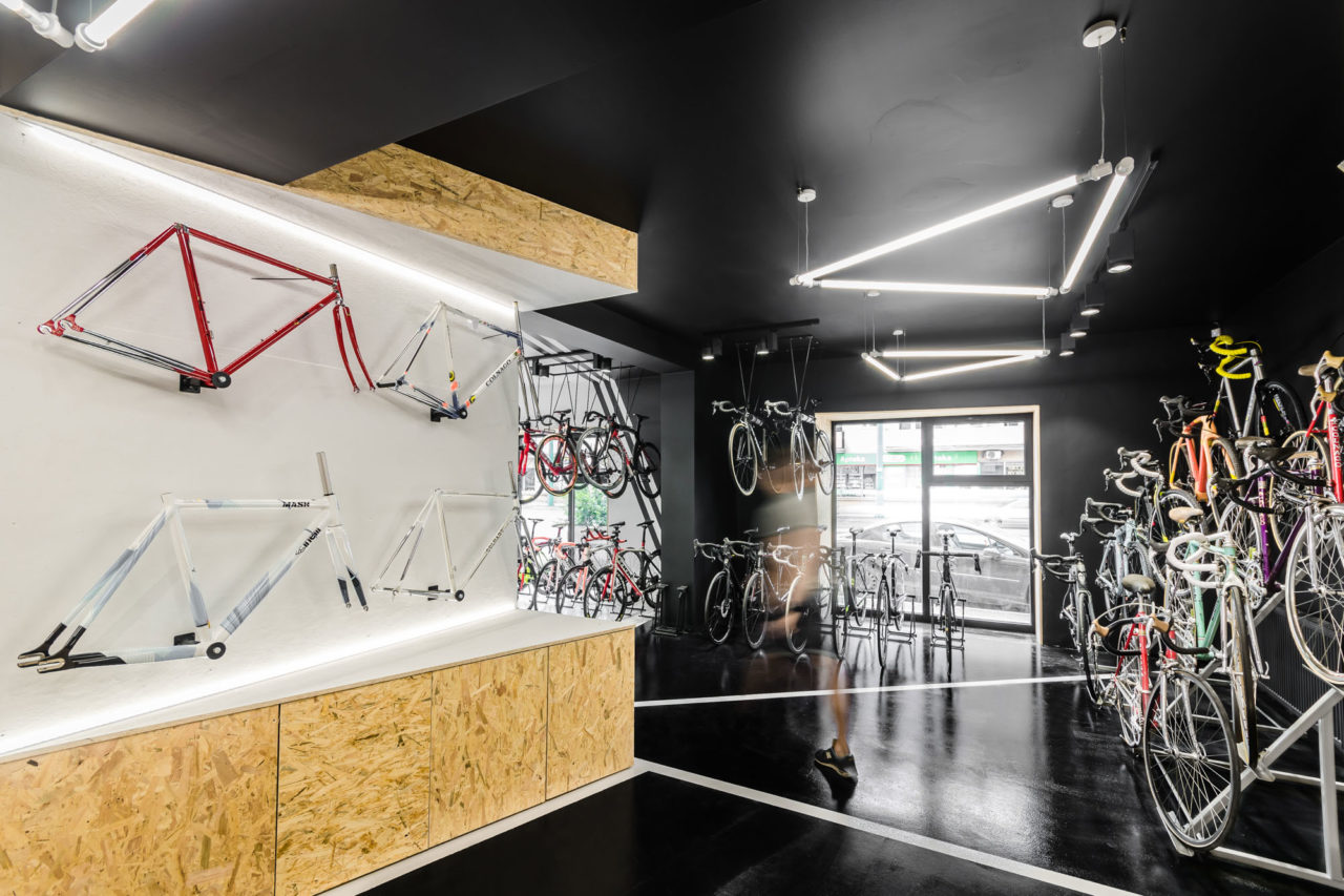
Apart from bicycle inspirations, the designers also applied the visual identification of the brand and its logo created by Minima Advertising People™. As the brand is owned by genuine enthusiasts, their passion and commitment had to be reflected already at the graphic level. The black-and-white interior matches the visual representation of VÈLO7, while the dividing lines and lighting refer to its triangular logo.
The rhythm of cycling races
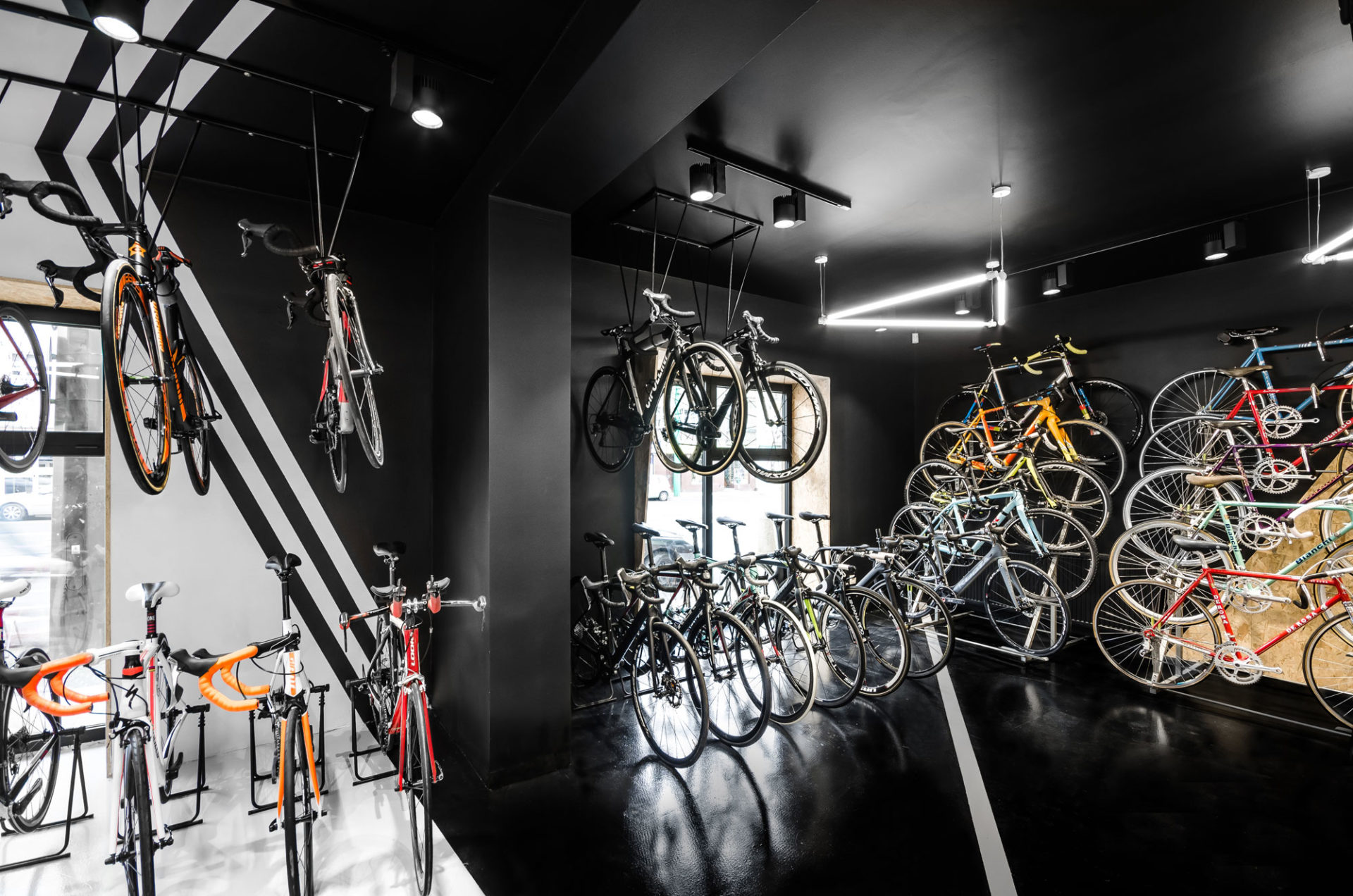
The ground plan of the entire store provides for the ultimate, albeit slightly concealed, cycling-related element. The respective zones are divided in a way that resembles a bicycle wheel with the display zone located in the centre (the hub) and converging lines representing the spokes. The interior has a dynamic form which is to reflect the rhythm of bicycle races.
