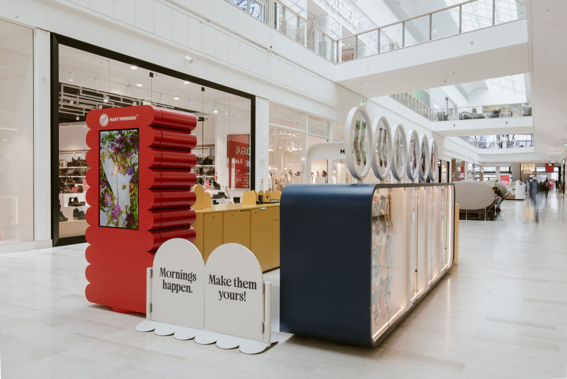
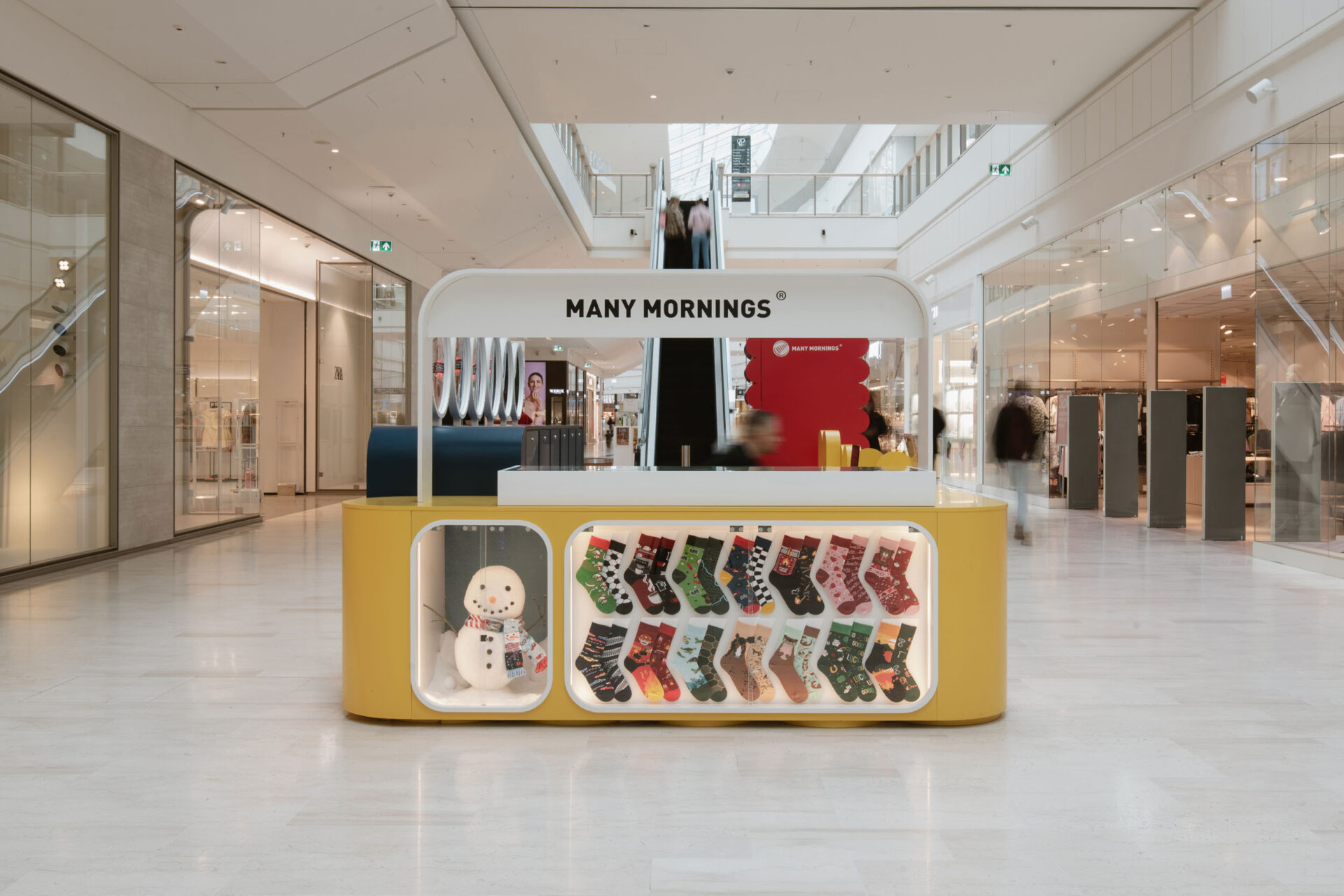
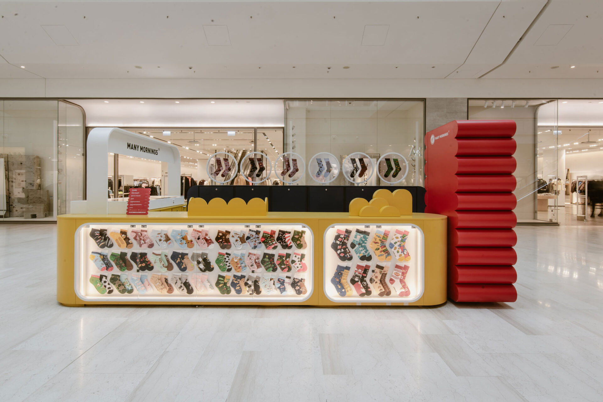
The concept draws directly from Many Mornings’ most recognisable idea: socks that are designed as a pair without being identical. Different patterns and colours come together to create a shared story.
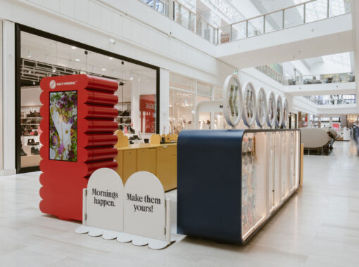
mode:lina™ translated this principle into architecture, composing the kiosk as a three-dimensional arrangement of contrasting forms, heights and functions.
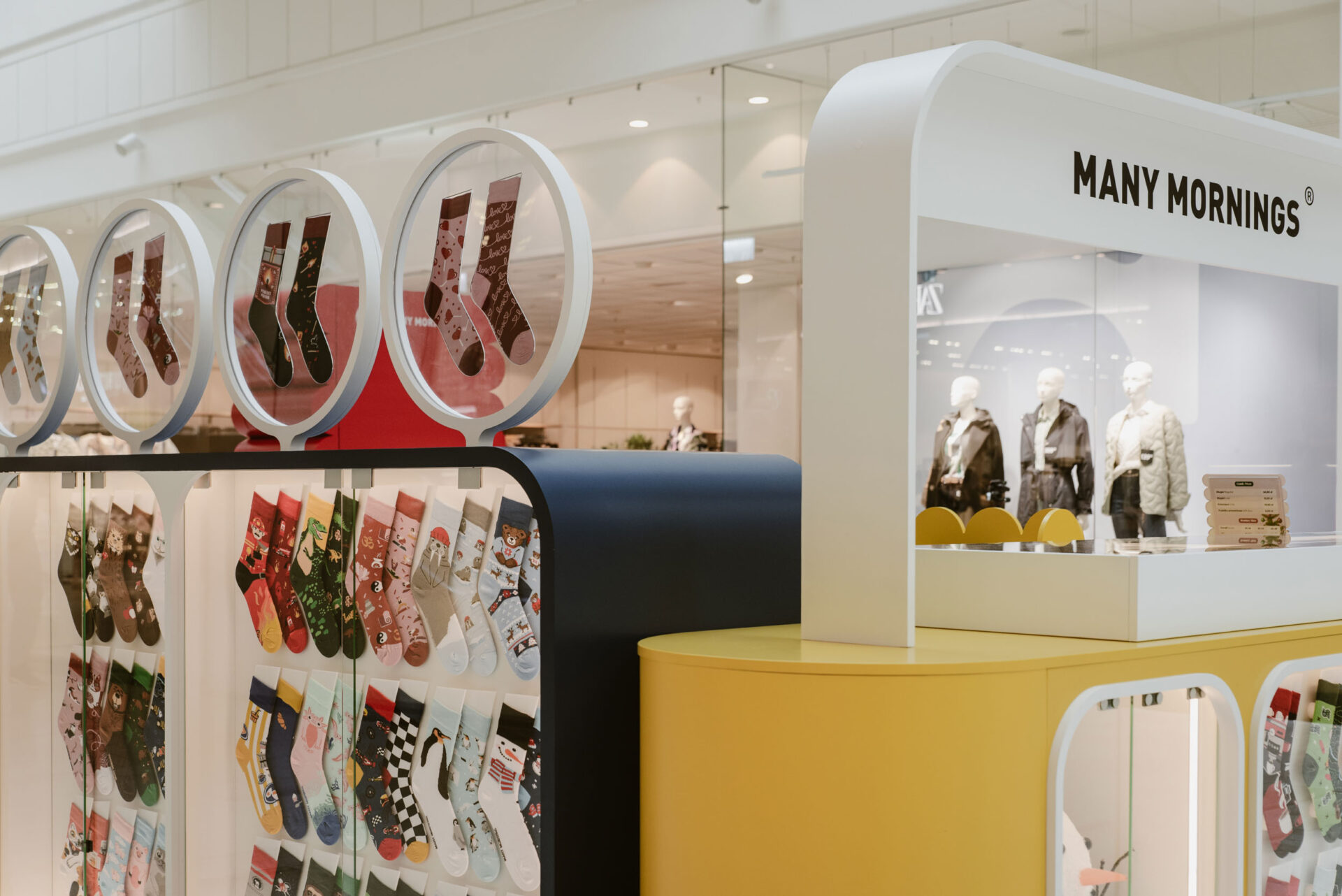
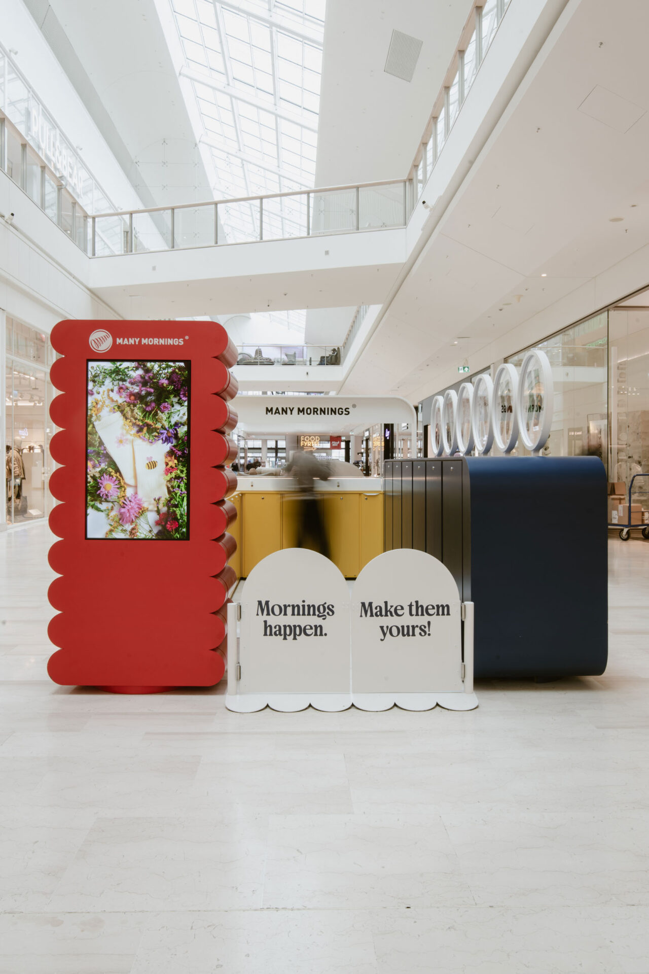
Colourful volumes sit side by side, appearing mismatched at first glance, yet forming a coherent and instantly recognisable whole.
Each element serves a practical purpose – from product display and storage to the customer service counter – while remaining part of a larger visual composition. Much like the brand’s socks, the individual pieces gain meaning through their relationship with one another.
Rounded edges soften the typically technical character of retail architecture and give the kiosk a friendly, almost toy-like quality. The gentle geometry creates a strong contrast with the straight lines of the surrounding storefronts, while keeping the space open, inviting and easy to approach.
The display was conceived not simply as a backdrop for products, but as a playful journey of discovery. Socks appear throughout the structure in a variety of frames, niches and illuminated showcases, encouraging visitors to move around the kiosk and explore new patterns, colours and collections.
Choosing a pair becomes part of the experience — more like browsing a gallery of miniature illustrations than shopping from a conventional display.
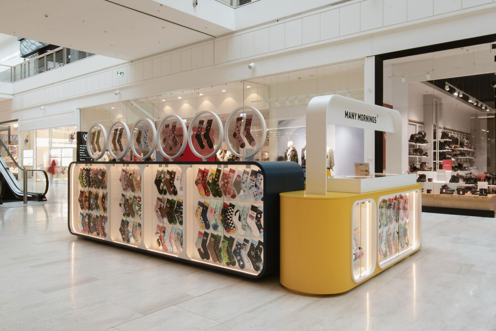
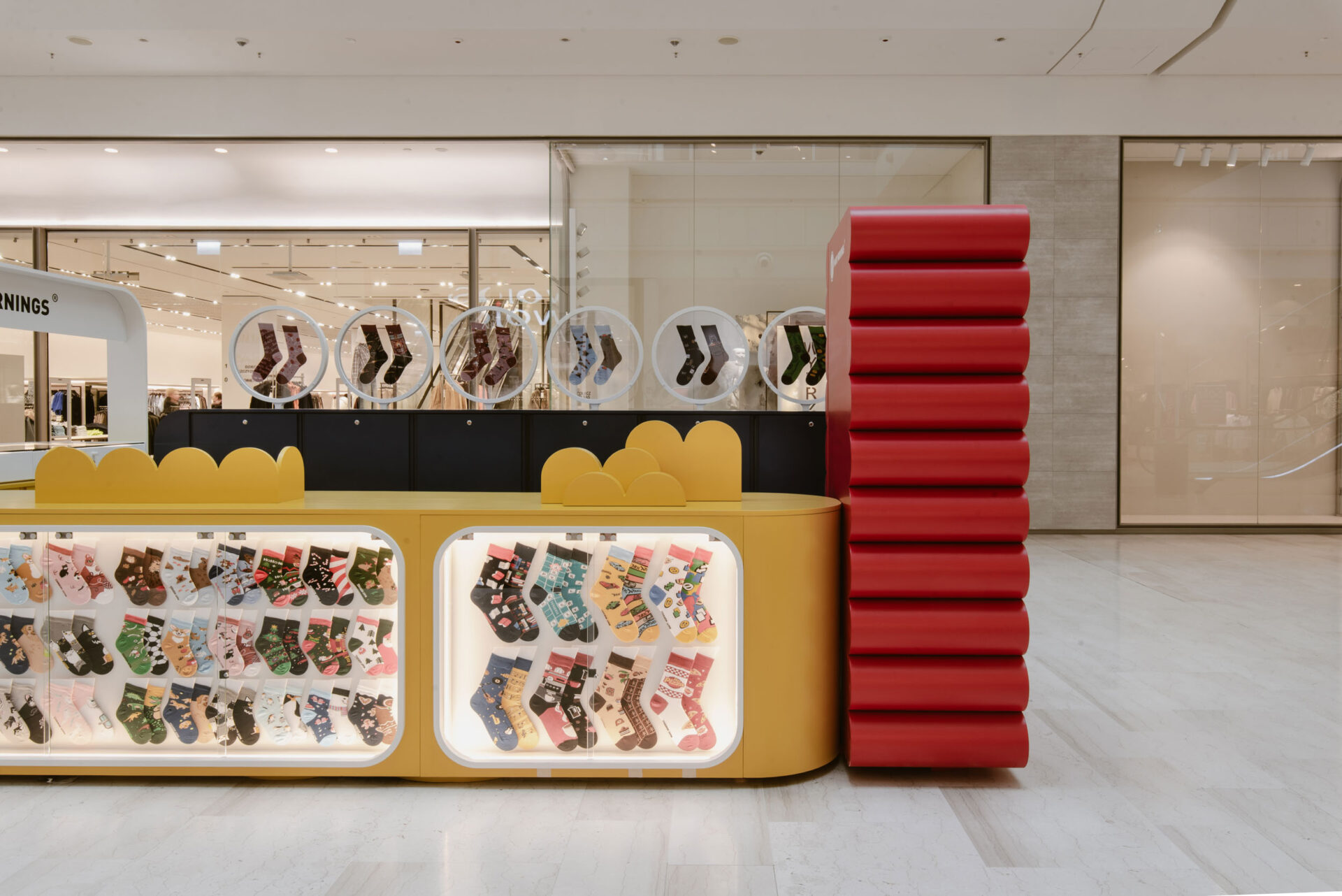
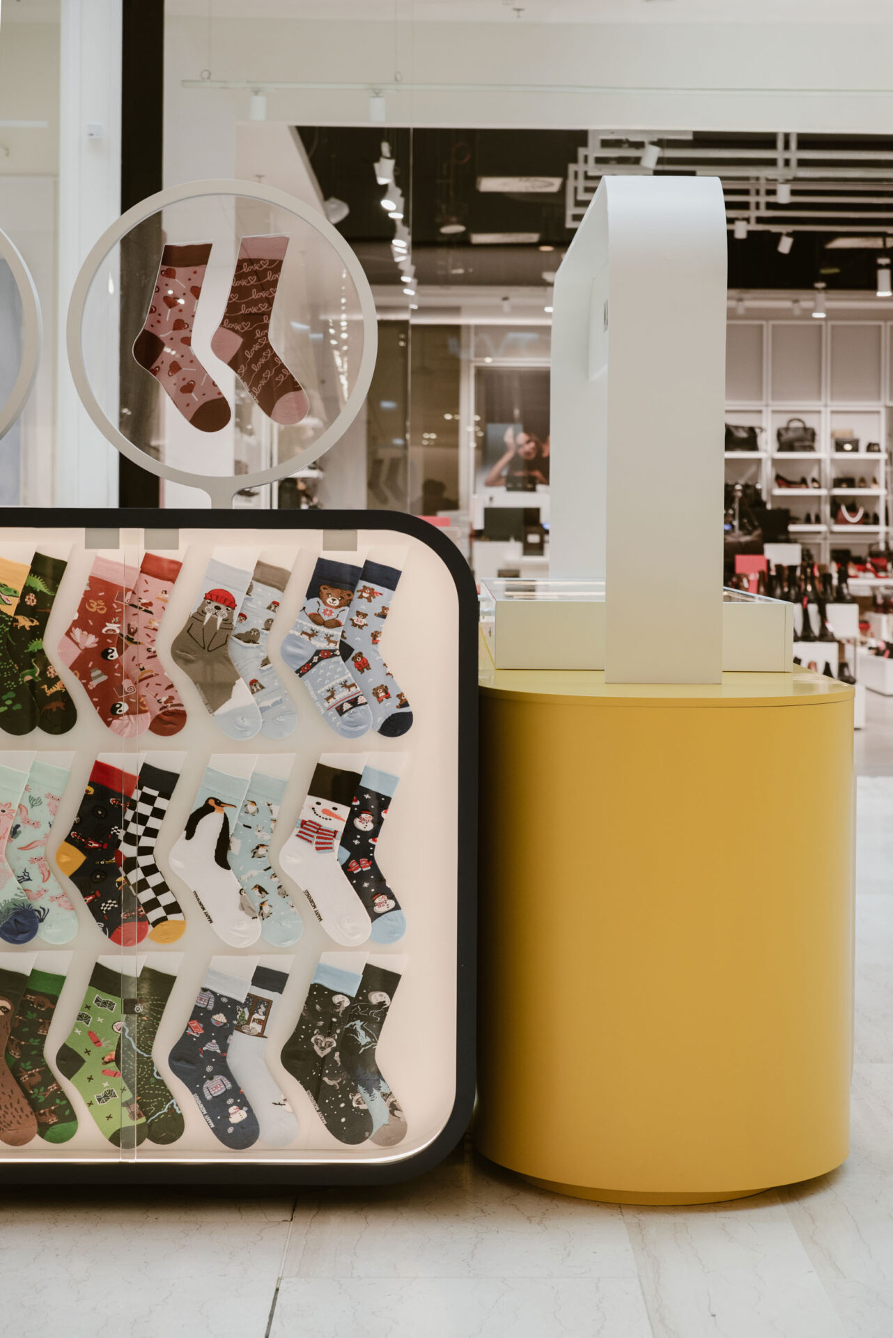
Selected designs are placed inside illuminated showcases, giving each pair its own stage. Presented in this way, the socks can be viewed not only as everyday objects but also as small graphic compositions. The lighting enhances their vivid colours and makes the display clearly visible from across the mall.
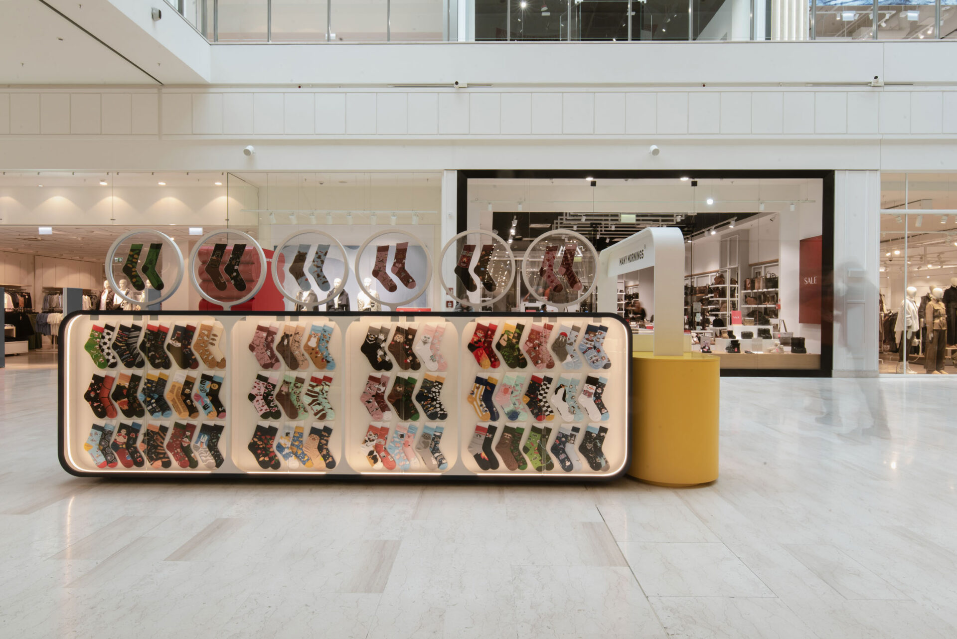
Circular openings built into the walls form another distinctive feature. Resembling portholes, lenses or magnifying glasses, they frame individual products and direct attention towards selected patterns.
By breaking up the larger surfaces of the kiosk, they also reinforce its playful and subtly surreal character.
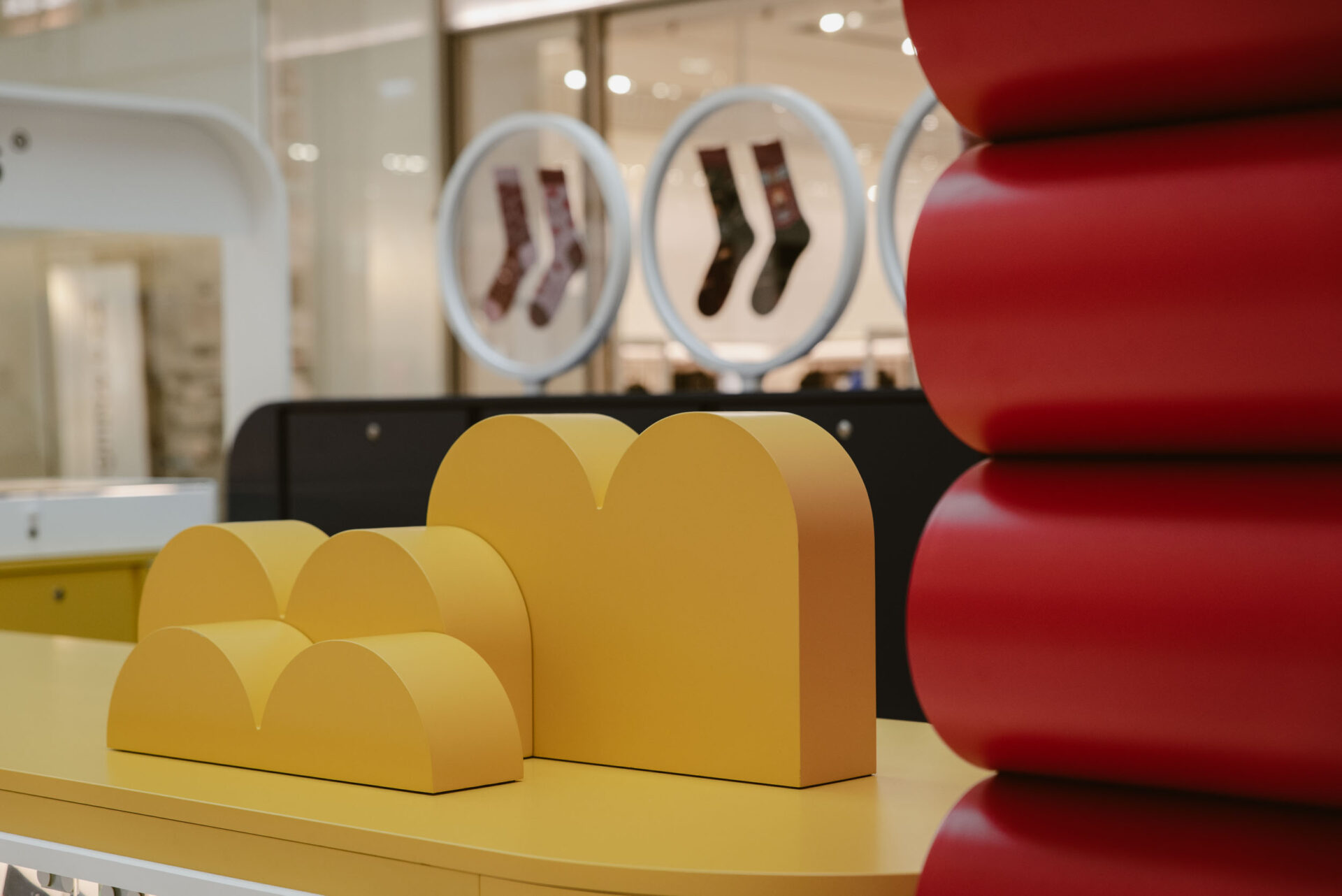
Above the colourful volumes, a light canopy-like structure recalls the familiar image of a small market stall. The reference is subtle rather than literal.
Instead of recreating a traditional marketplace, the design reduces it to a simple architectural gesture and reinterprets it through the contemporary visual language of Many Mornings.
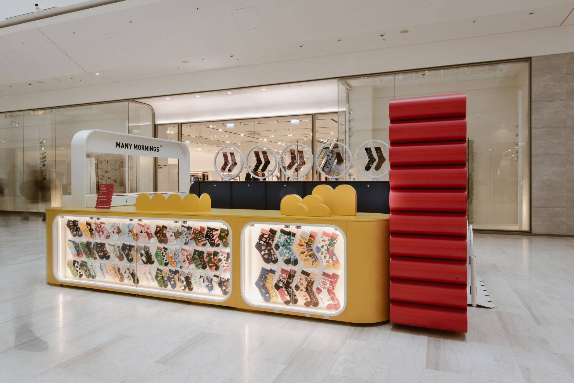
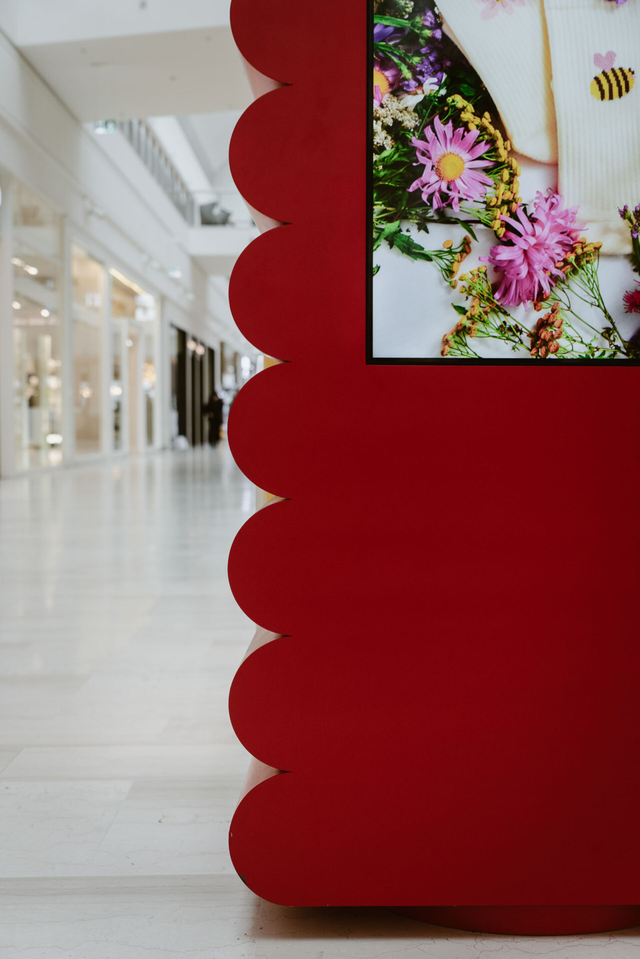
A bold red element with a soft, irregular silhouette becomes the kiosk’s main visual landmark. Its shape brings to mind a biscuit or a playful graphic symbol, while its intense colour stands out against the lighter structure. Visible from the far end of the arcade, it announces the kiosk’s presence and signals that something unexpected is happening within the otherwise uniform retail environment.
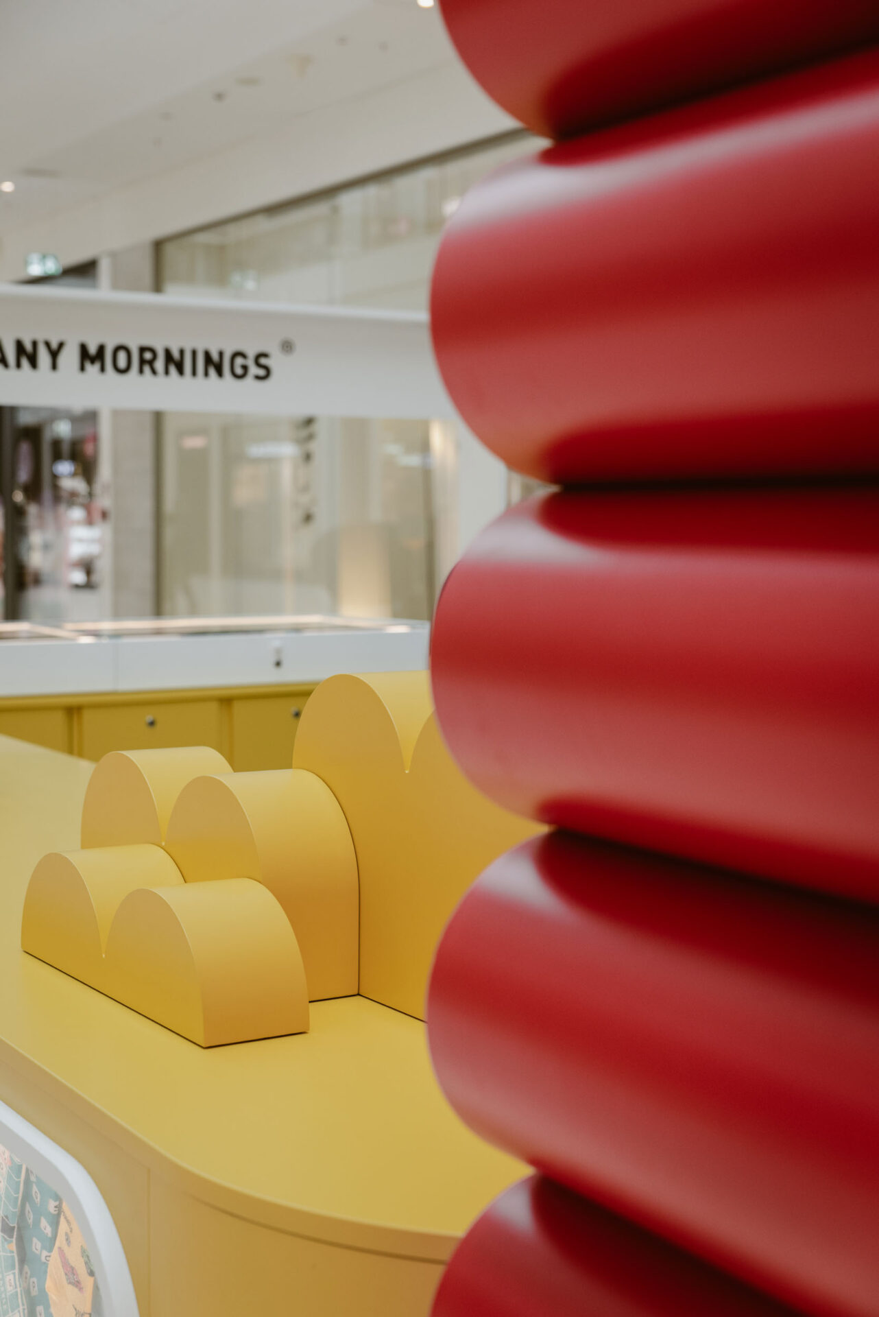
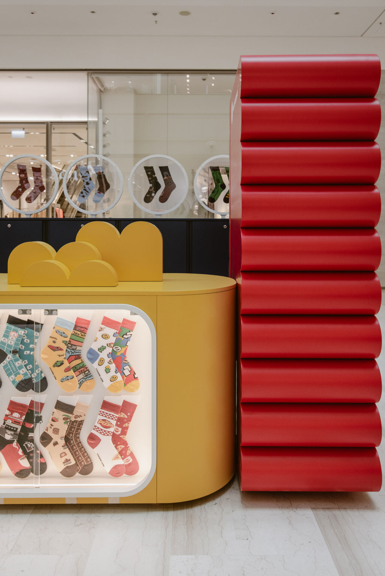
Colour plays an organisational role throughout the project. It distinguishes individual functions, defines different areas and connects the architecture with the brand’s visual identity.
Red, blue, yellow and pale surfaces come together in a composition that feels lively without becoming chaotic. Every element has its place, contributing to a larger and carefully balanced story.
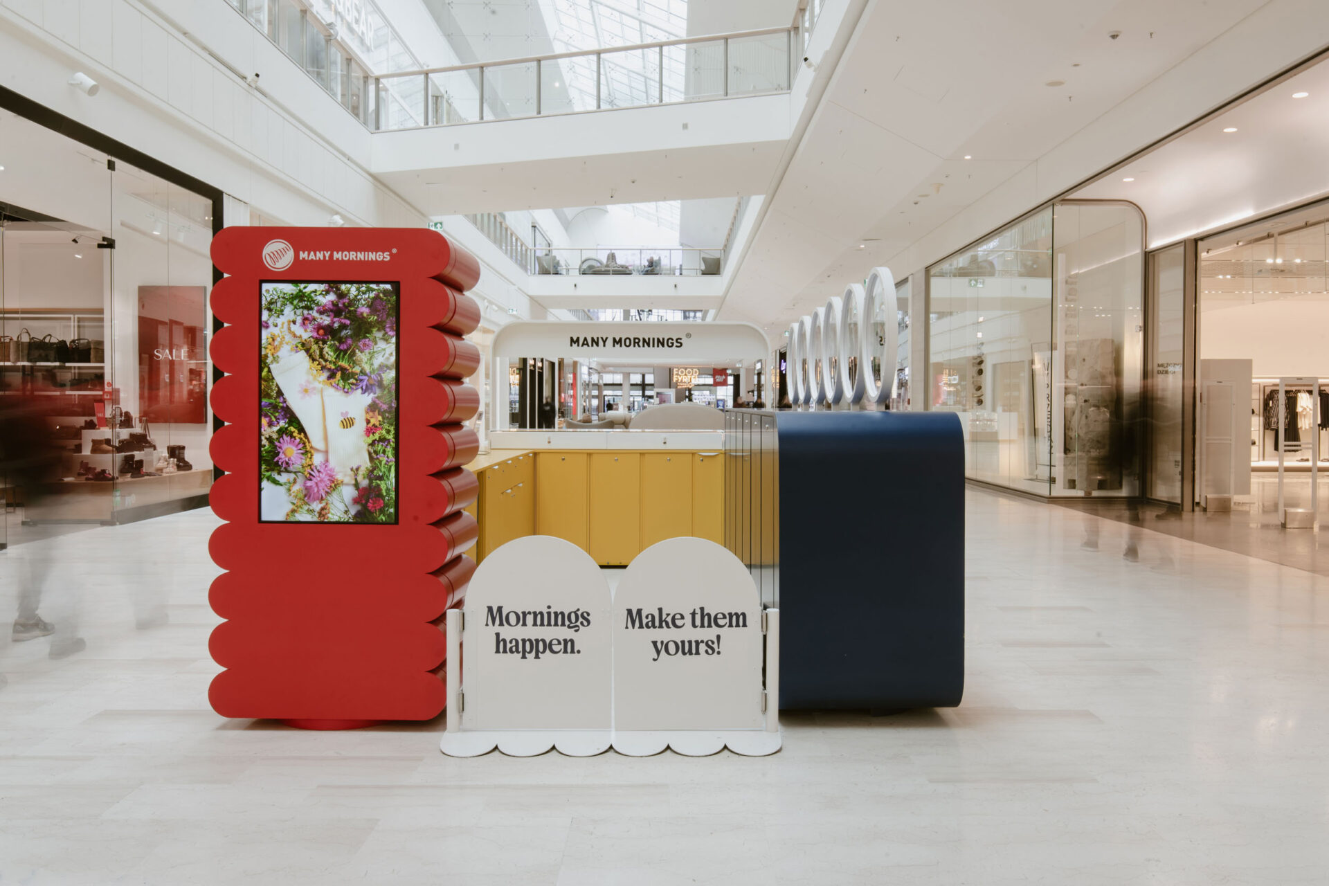
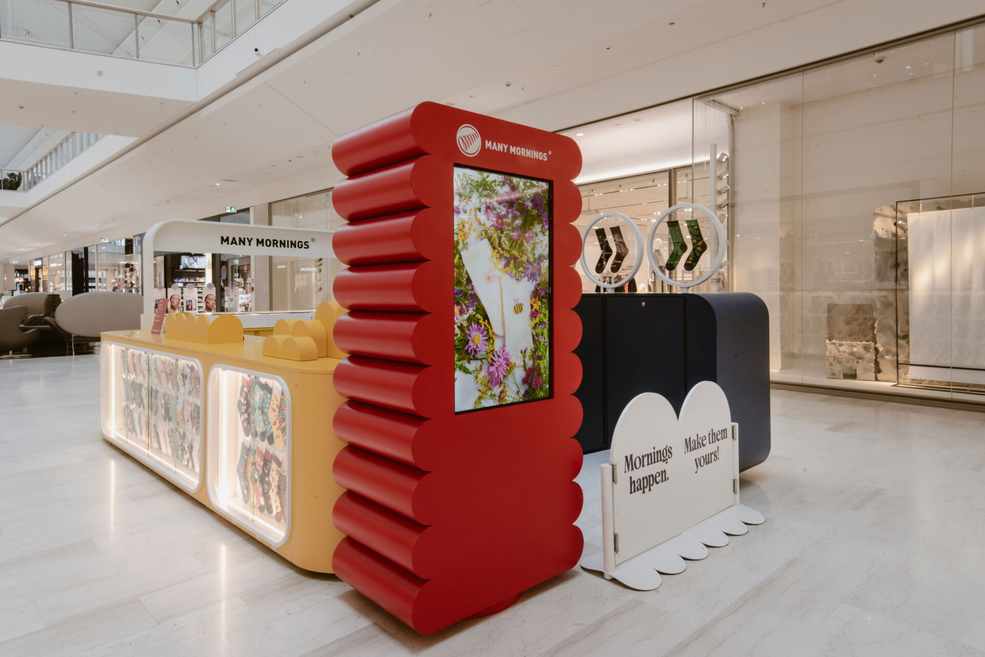
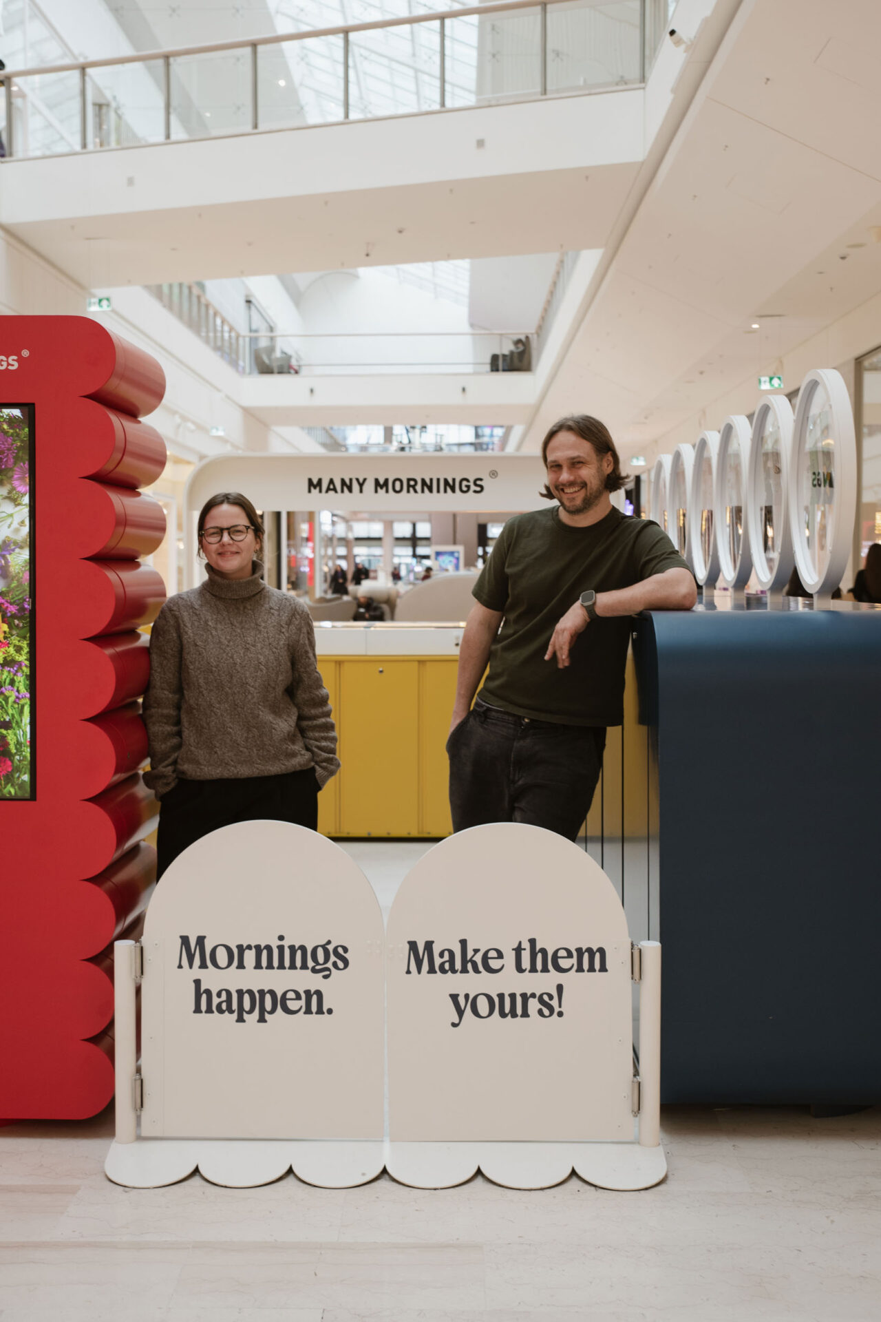
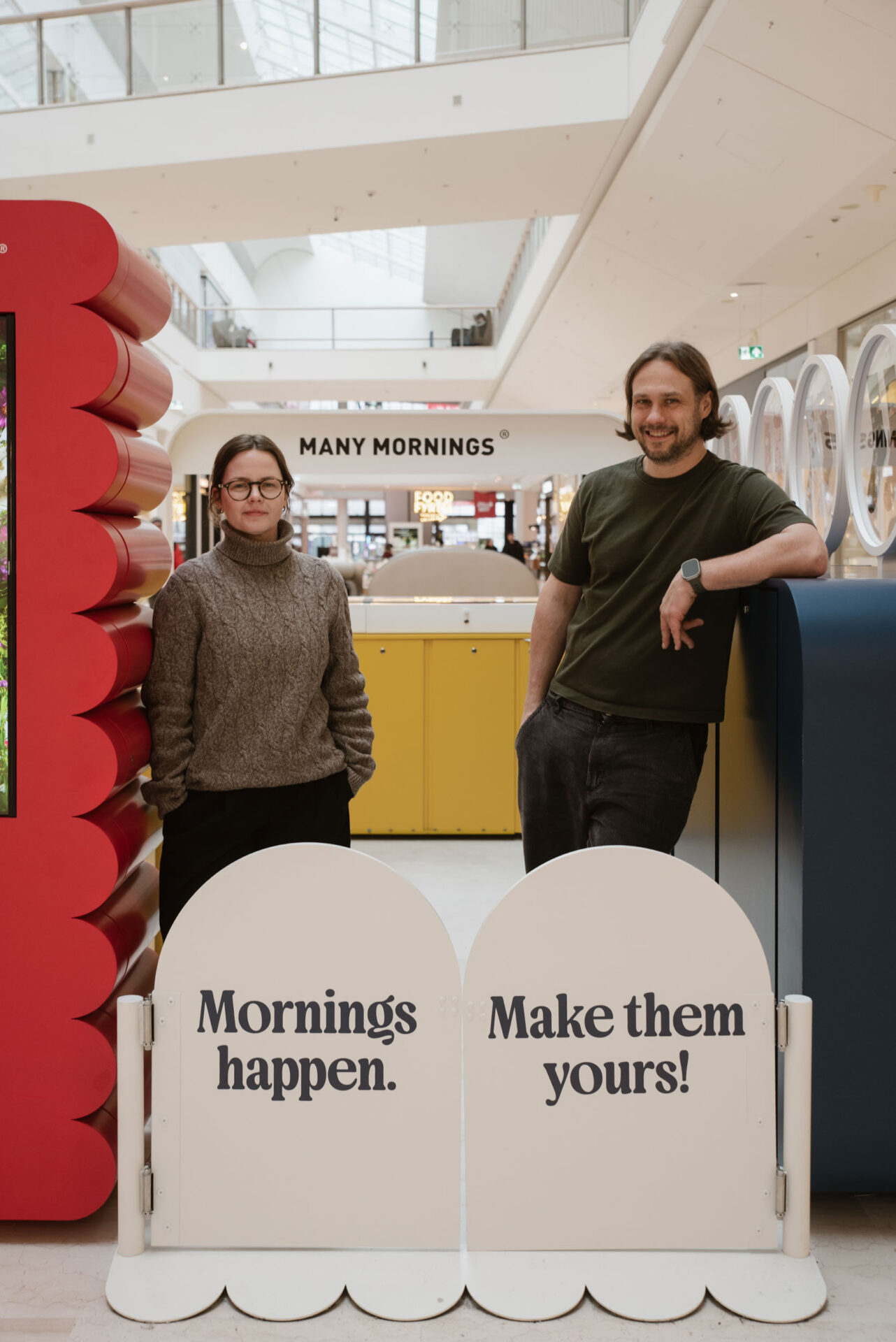
The design is completed by the phrase displayed across the rounded entrance frame: “Mornings happen. Make them yours.” More than a brand slogan, it captures the spirit of the entire project — an invitation to approach everyday choices with greater freedom, individuality and a sense of humour.
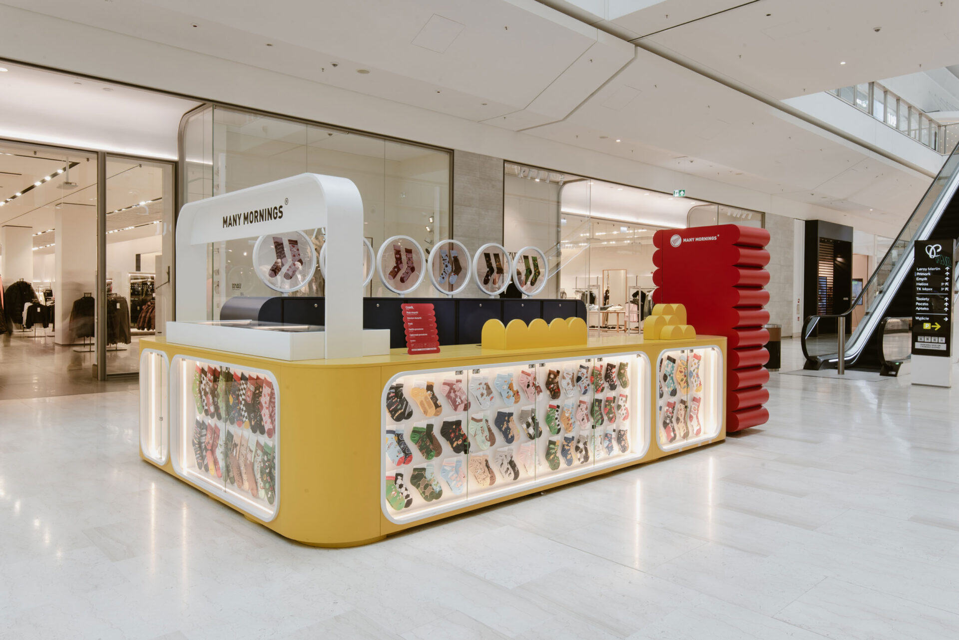
The Many Mornings kiosk shows how even a compact retail space can create a rich and memorable brand experience. Soft forms, vivid colours, illuminated displays and unexpected details attract attention naturally, encouraging passers-by to stop and look closer.
What begins as the purchase of a pair of socks becomes a short story about discovering how seemingly mismatched elements can fit together perfectly.